Oct. 31, 2020: Grim Addition
These graphs represent case increases and cases per 100K of population for WI's 10 most populous counties. I've added raw data and a chart showing death increases since April, 2020.
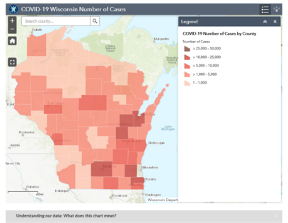
These graphs represent case increases and cases per 100K of population for WI's 10 most populous counties. I've added raw data and a chart showing death increases since April, 2020.